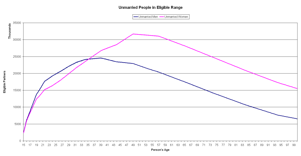
 Well according to this graph, girls should have the best chances to pickup guys in their early 30's while for guys it's all gravy all the way up to the 50's. This is supposedly based on US census information, except it doesn't add up... How can there be so much more single girls then guys? I mean, I understand the lines should taper off at different rates because of life expectancy. But I don't see why the area under the curve should be so different.. unless man are marrying each other?

Monday, September 10, 2007
When is the best time to pickup?
Well according to this graph, girls should have the best chances to pickup guys in their early 30's while for guys it's all gravy all the way up to the 50's. This is supposedly based on US census information, except it doesn't add up... How can there be so much more single girls then guys? I mean, I understand the lines should taper off at different rates because of life expectancy. But I don't see why the area under the curve should be so different.. unless man are marrying each other?
Subscribe to:
Post Comments (Atom)
 Podcast


2 comments:
Well, first of all this is just a bad graph.
The y-axis indicates that it is measured in 'thousands' which, to me (and I hope most people) means that where it reads 30000 that actually means 30000x10^3 (or 30 million). If that's the case then unmarried women aged 47-60 make up more than the entire population of the US. So I can only assume that the scale is literal and not in thousands.
The y-axis is also 'eligible partners', which, assuming we're talking about heterosexual partners, actually means the opposite of what I think the graph is trying to convey. That is, according to this graph, unmarried women at age 50 have over 30000 eligible partners when I think what it's trying to say is that there are 30000 unmarried women at age 50. (If "eligible partners" is accurate, then it actually seems like girls have the deep end of the dating pool with far more eligible partners at every age after 35).
Taken at it's most basic interpretation - that this is a graph showing the number of unmarried males and females at given ages, the curves roughly represent the gender demographics in the US - males outnumber females until around age 35, then the trend is reversed (according to the 2000 US census) - and more total males at an age would likely mean more single males (and vice versa). The numbers game would explain a difference between the number of single men and single women, but not a difference so large. As AC points out, the numbers don't work. This graph suggests an female to male ratio over all ages of 60/40 (very rough calculation) rather than the real ratio of 51/49.
The other strange thing is that, again as AC mentioned, you would expect the lines to taper off at different rates because of life expectancy differences (and the growing gap between the number of women and men at later ages), but these lines don't taper off at different rates at all. They have the same slope!
What's the source of this graph? Is it based on census data for the entire US (the numbers don't add up for that) or just a particular area? What do 'eligible range' and 'eligible partner' mean exactly? Maybe a difference in what constitutes an eligible partner for a man vs. a woman can explain the graph. My guess would be that the fact that we're dealing with ranges that could shift with gender/age is the answer.
I'm not really sure what to take away from this. Does anybody else have interpretations?
Very good points. I'm wondering why are there so few unmarried 15- and 16-year-olds.
Post a Comment